Hi folks!
Last year I really, really meant to do Inktober properly, but stuff got in the way too much. This year, I am being far more disciplined - and so far I have stuck to my resolution.
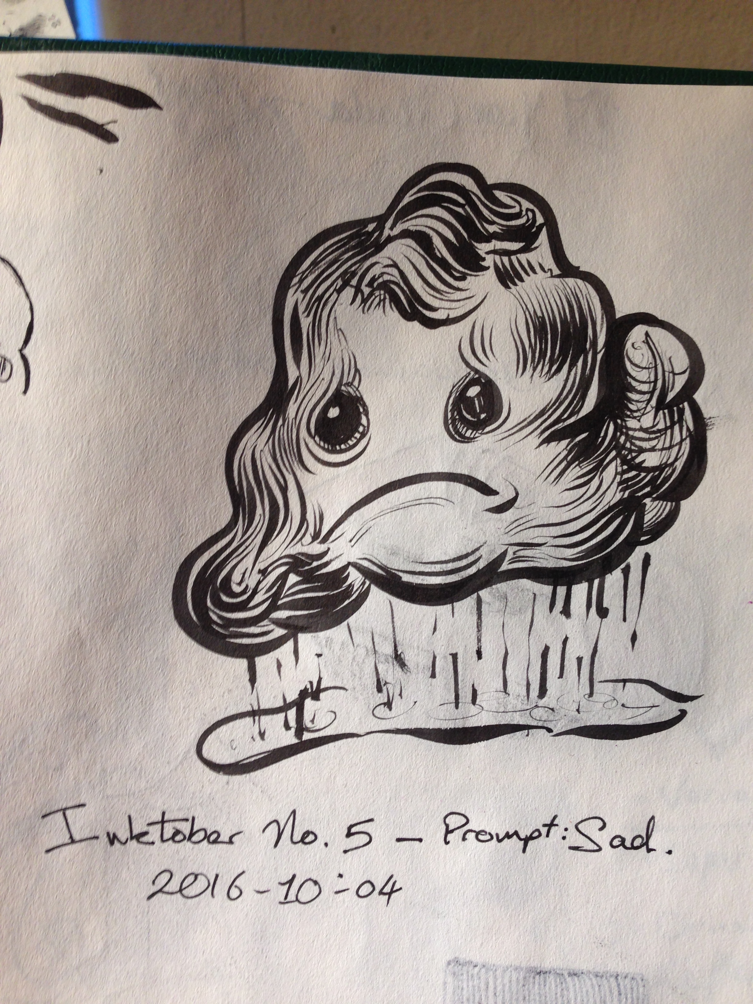
Inktober 2016 No. 5 - Prompt:Sad
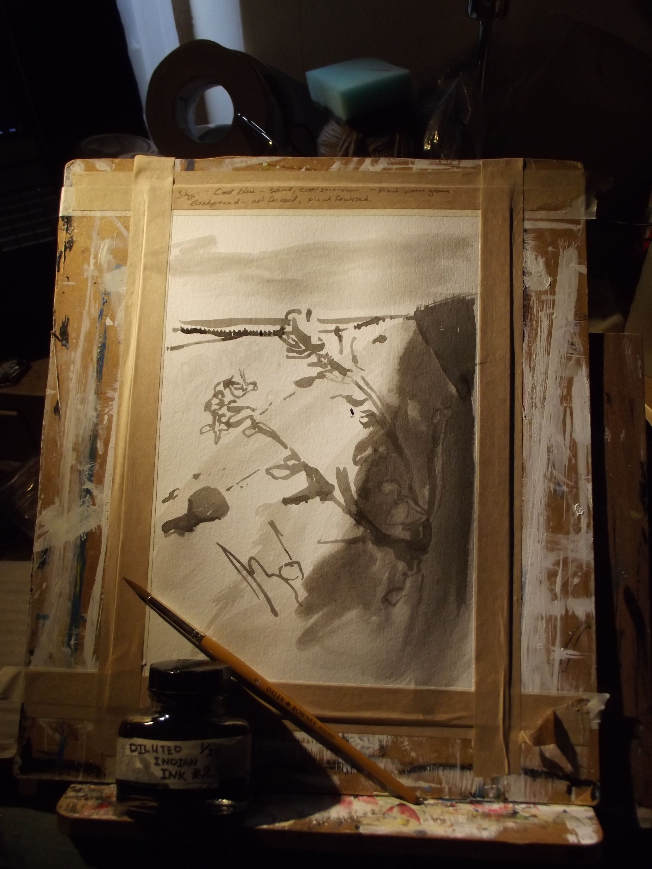
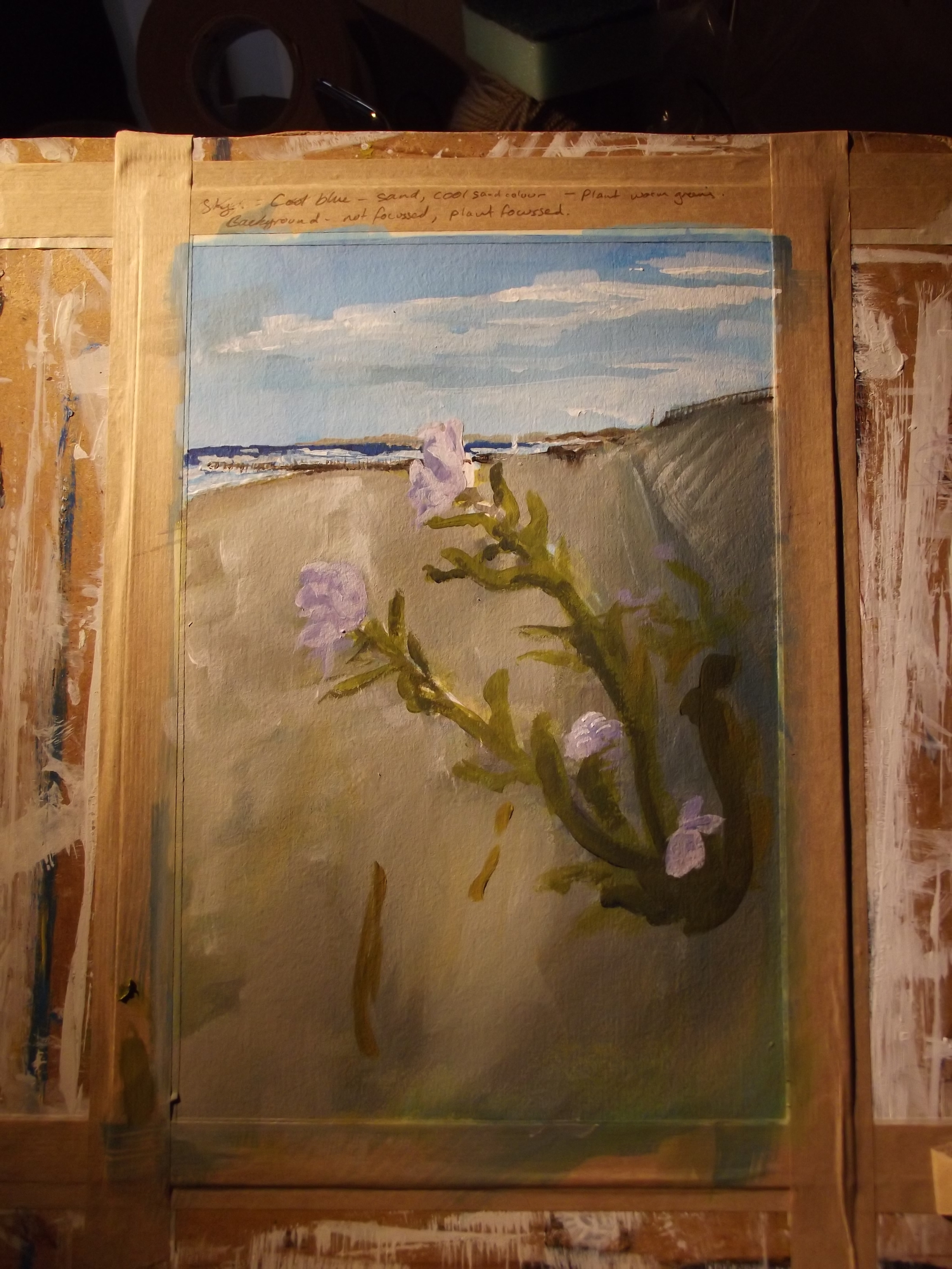
I'm using as mixture of my own ideas and prompts, and also giving myself restrictions - for example, the first week has been one in which I have done Brush-Only inking, and indeed minimal penciling before hand. It's a great exercise in bravery, as if you don't even have an under drawing, ever brushstroke gets really thoughtful.

Inktober 2016 No. 6 - Treasure Chest
So far, most of my Inktober drawing time has been grabbed in-between feeding my baby and her waking up following the post-bottle nap, so its time that is often pushed. What I've really found, is that when you don't have time to deliberate and wonder if an idea is actually any good, it's almost easier - you simply draw whatever comes to mind first. Many of threse ideas are simple, and crudely executed - but that's ok.
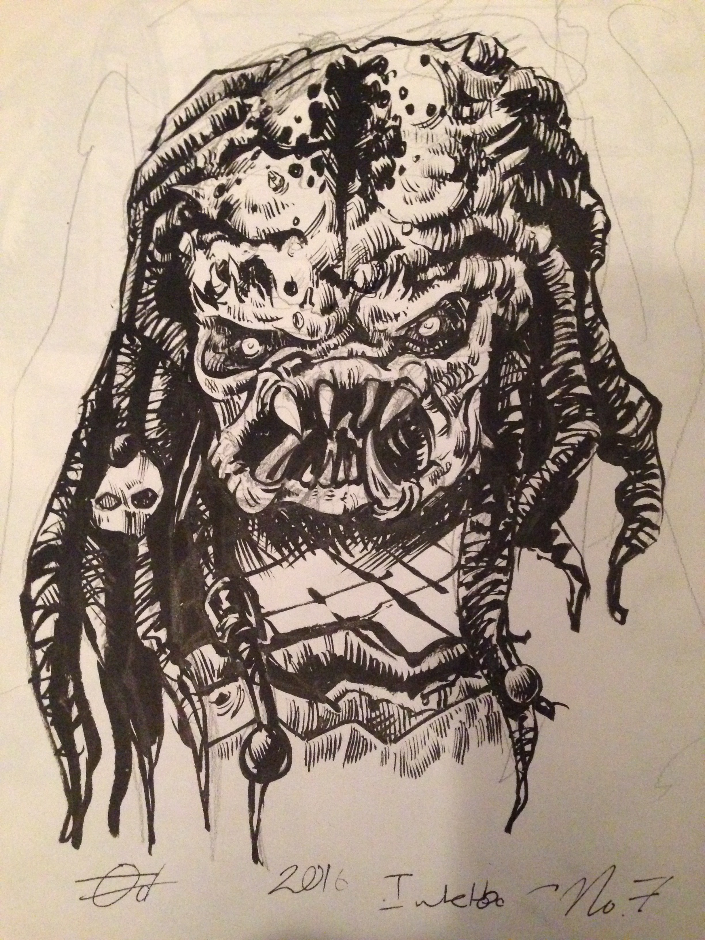
Inktober 2016 No. 7 - Predator
The point of this exercise isn't to produce reams of high quality material; rather, the point is to develop the discipline of 'just showing up' ready to work, even under adverse conditions.
hope you enjoyed my thoughts - I'll always be happy to discuss things.
Sandy