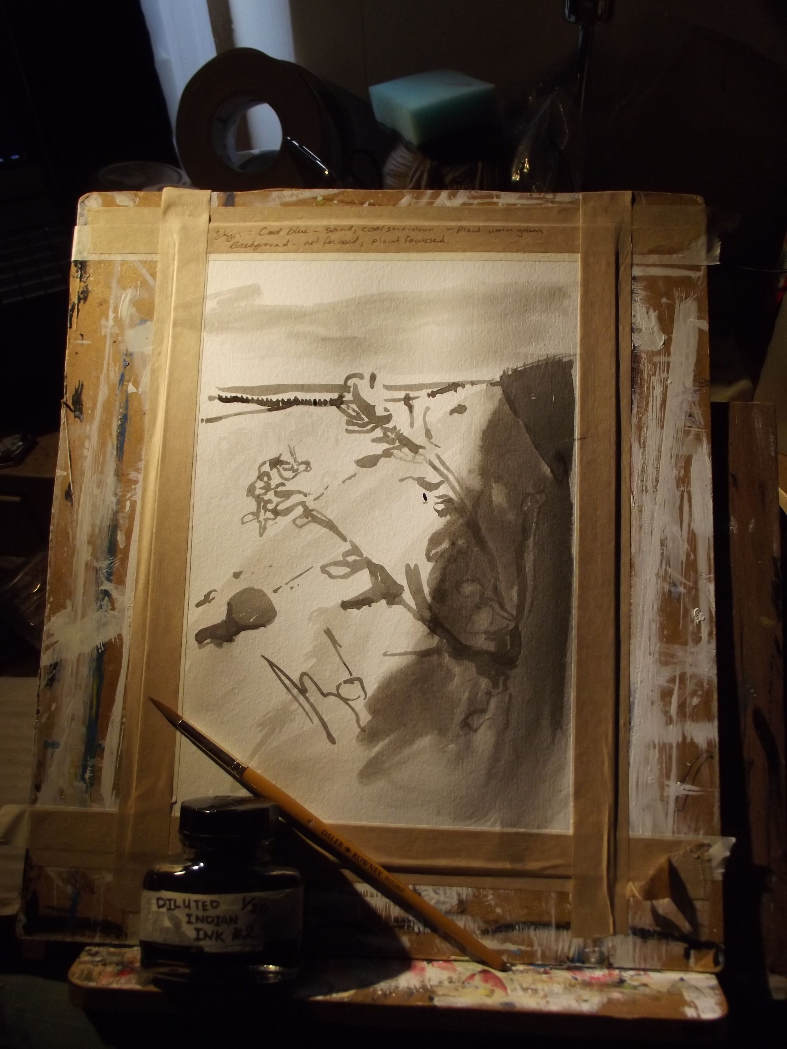
Learning conclusions:
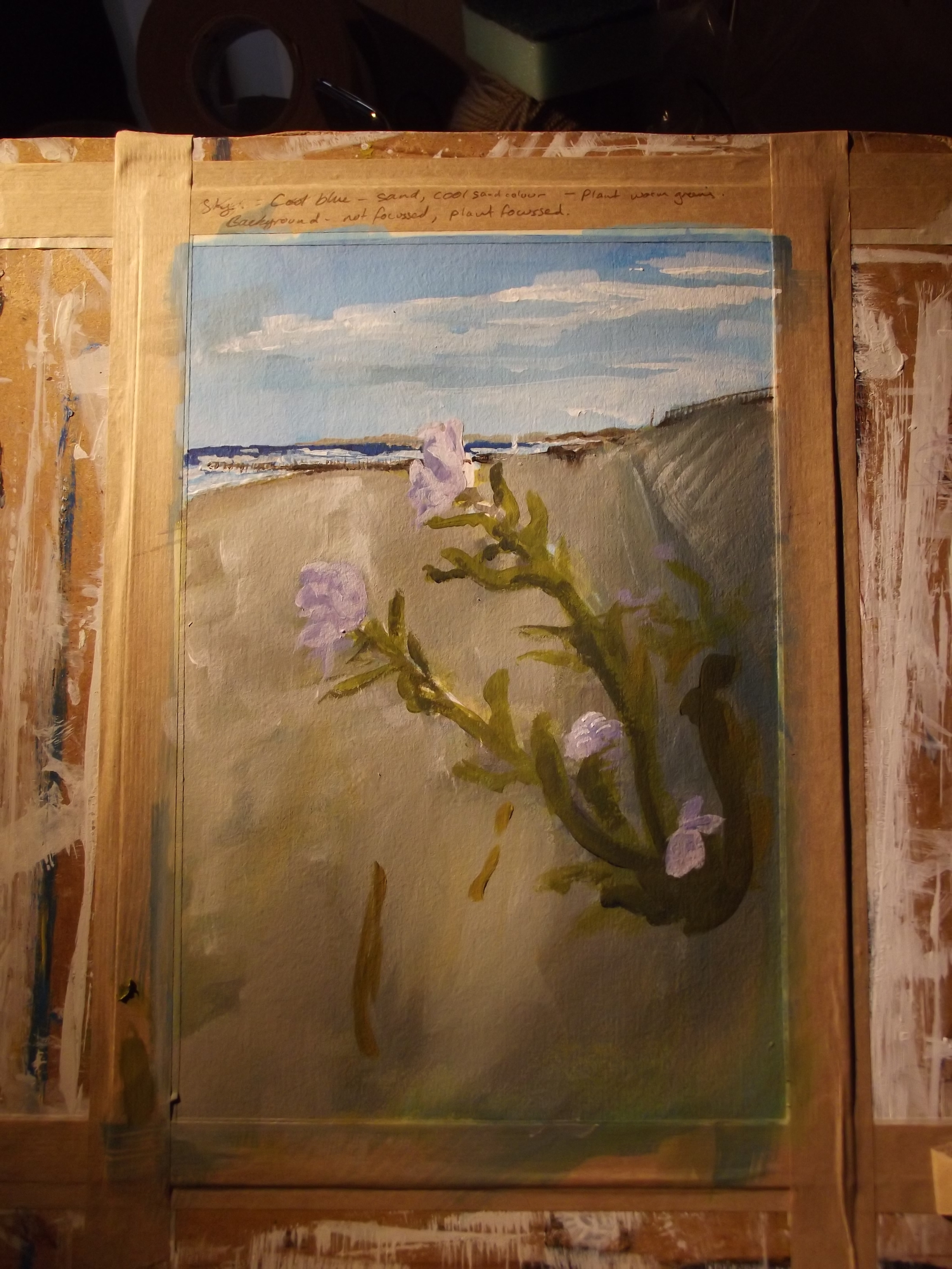
The Bad: What really strikes me about the final image is that the foreground flower barely seems to stand out at all - and to fix that, I need to be more careful about arranging a strong contrast in both colour and tone. Having strong tonal contrasts always makes everything look better, and I really haven't managed it. I think doing a careful, through underpainting in burnt sienna and umber would probably do the trick, but will add a lot of time to the work, as I would basically be painting it twice. Still, that's the price of painting.
I also think that it would have worked better in a square painting, rather than a rectangular one. Although I put some work into planning the composition, I thought it would turn out better than I think it dd - and for some reason I think that square would suit it better; chopping off the extraneous bit of boring foreground at the bottom would probably give the composition better balance overall.
Probably the colour of the sea is wrong. It looks too intensely blue, although I promise it was super blue when I saw it. It's one of these things that's needed by artists - not slavish devotion to the source material but the judgement to interpret and alter the image in order to make it look better.
The Good: I like how the sky turned out, and planning the painting in stages really helped me work through it sensibly, rather than looking at it halfway through and wondering what to do. I also liked working lots of texture in all over the painting to contrast with the smooth plant stem and petals.
How I'll improve this: I'll be redrawing it with more sketching, and altered composition, worked up with careful eye on the tones before the colour goes in. At least with acrylics, you have the substantial advantage of a really fast drying time, so you can work in layers very quickly .